Branding Journey
Published in ATÖLYE Insights · 7 min read · June 16, 2017
The visual and conceptual stages of our logo's redesign process
Authors: engin ayaz, Co-founder and Head of Design, Bala Gürcan, Communications Assistant, Editor: Emre Erbirer
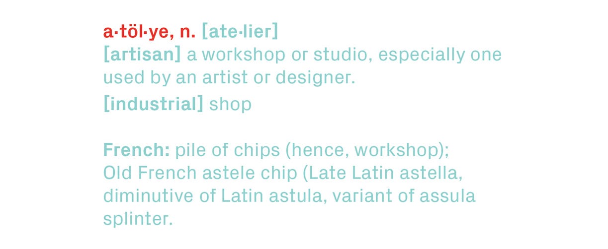
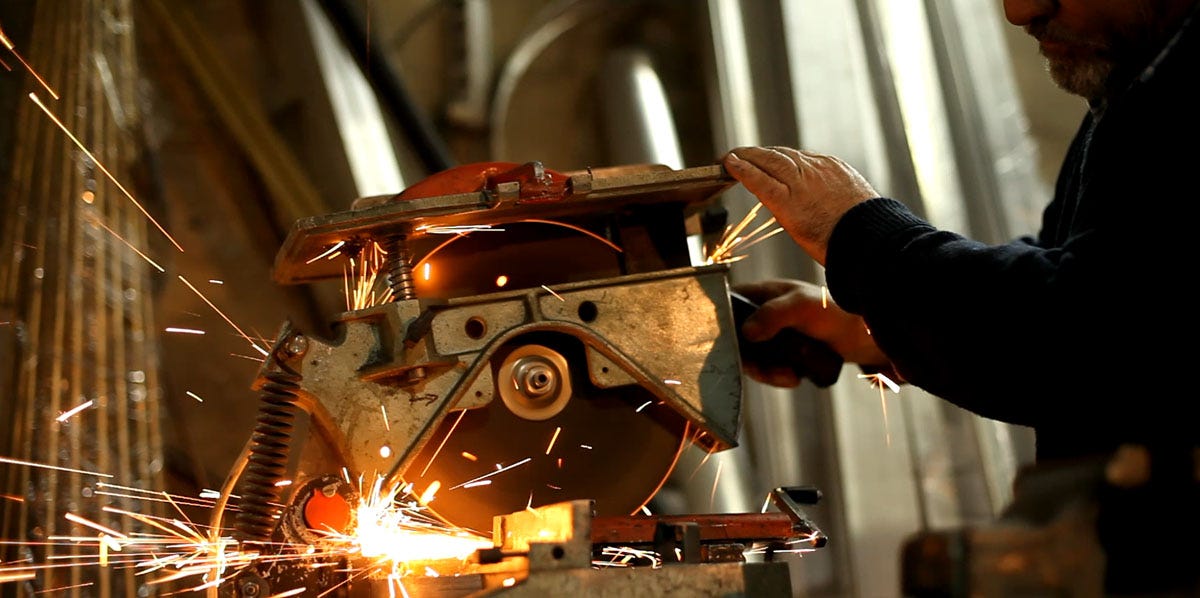
The word "atölye" derives from the French word "atelier" from the 19th century, which stands for a workshop or a private studio, and originates from the Old French word astelle, meaning 'splinter of wood,' reminiscent of a carpenter's space. This brings to mind an image of a carpenter using his tools, revealing sparks, radiance, and creative energy in the process.
At the heart of ATÖLYE lies precisely this image of a spark, both in physical and a metaphorical way. Constantly engaged in productive processes, we seek to release the creative spark that is implied through the etymology of our name.
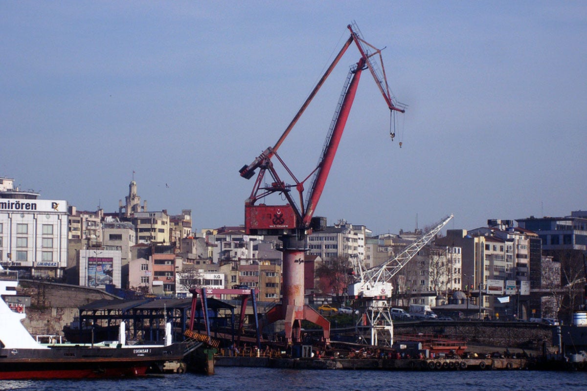
Being situated in Istanbul, a unique cosmopolitan city that combines a long history of craftsmanship and industrial heritage, ATÖLYE exists to foster a collaborative, emergent culture of creativity among its community and the wider network.
Acknowledging the transformation from an industrial to a knowledge-driven society, ATÖLYE's mission is to exemplify what it means to co-produce in a post-industrial urban environment, today.
On a micro scale, ATÖLYE takes cues from the craftsman culture and its deep care for quality while transposing it from physical things to a convergence between physical and digital (i.e. phygital) worlds. On a macro scale, ATÖLYE aims to create an example for repurposing industrial spaces from goods production to knowledge production.
Given that as "atölye" is a word with distinct connotations of its own, it was important for us to differentiate the specificity of the usage. The common use of the word brought along an array of locations and brands that had taken up the name. The word was ubiquitously used, yet always in niche settings, specifying itself either with an address (atölye 33), a focus area (yemek atölyesi or "food atelier") or an adjective (vizyon atölyesi "vision atelier").
Yet no one had attempted to own the word ATÖLYE on its own.
Through our decision to adopt the name with all capital letters, ATÖLYE, we endowed it with a prominent visual form even within dense texts.
Moving to the visual side of the journey, we continuously iterated and refined our logo. Below, we want to share an abridged version of this journey.
The Logomark
The logomark was imagined as the most minimal way of expressing the platform, and hence the logo becomes a compression of its visual and symbolic components.

The first version was drafted as a result of a quick ideation exercise in late 2012. The nice aspect of this logomark was its simplicity along with its open-ended interpretation potential, from a symbolic, visual, and literal standpoint.
Symbolically, the AT mark had strong primal associations, made up of two basic forms that also appear together in early Eastern symbols (such as the Chinese symbol for "tree") .
The simple nature of the form was also in alignment with the well-known saying "good logo can be drawn by a toe on sand."
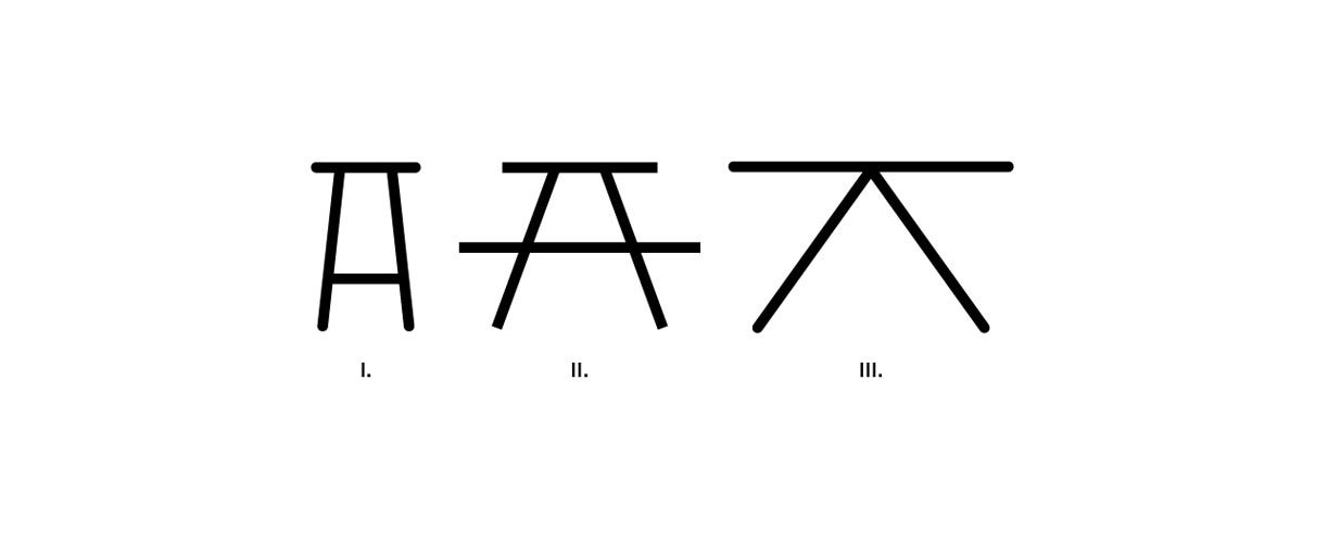
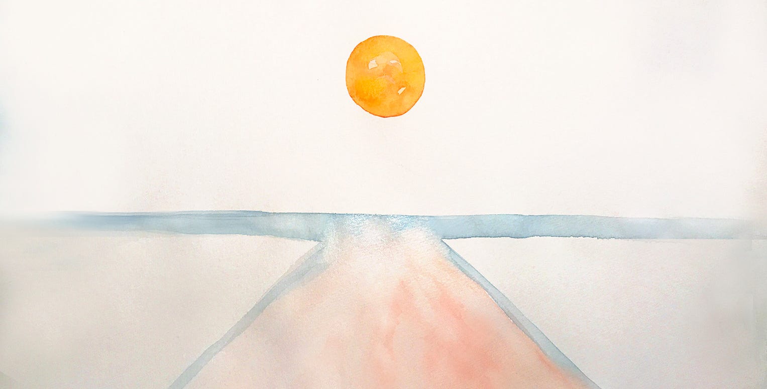
In terms of its gestalt, the logo echoed the shape of a stool (fig. I), a table (fig. II) or a paint stool. Such furniture pieces contribute to the subliminal message of being rooted in physical space. Finally, from a more abstract standpoint, the logo could be seen as signifying a long journey into the horizon (fig. III), through a play on linear perspective.
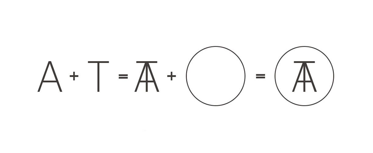
From a basic components standpoint, the logo can be seen as the first two letters of ATÖLYE -A and T- coming together into unison.
In all scenarios, the surrounding circle was used to hold together the figure, and to organize the negative space. A circular outer form also implied the soft, community-driven nature of the venture.
The Evolution
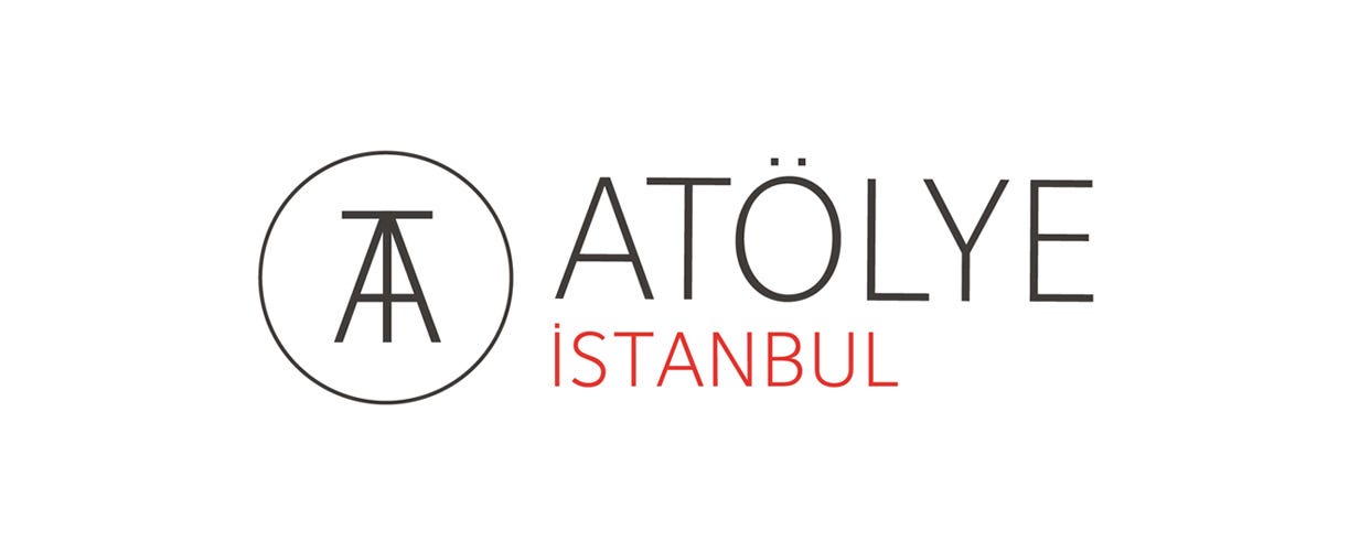
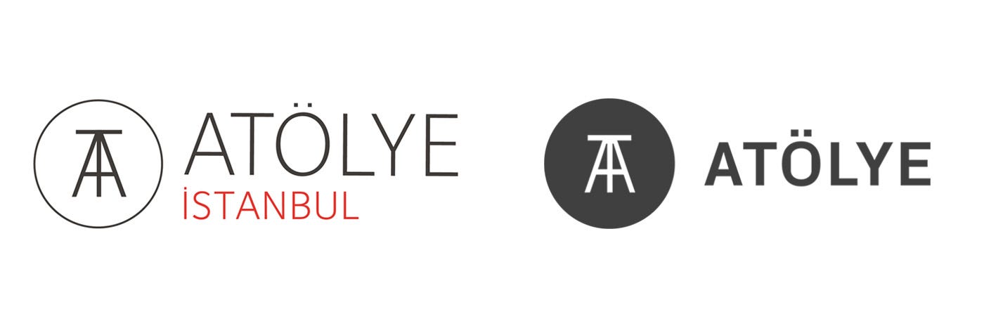
Extending our view into the complete logo set, we first established the platform as "ATÖLYE İstanbul", due to the initial idea of spreading out to various other locations and cities. Imagining that the project would scale and that we would open different locations, we left the lower part a bit smaller to fit cities of long names, and also made it red to imply its secondary importance and shifting nature.
However, three years into our venture, we had started to have a few issues regarding the logo's design features and decided to redesign some of its properties. So we embarked on a 4-month redesign journey.
From a business model standpoint, we realized that the core value proposition of ATÖLYE was not its real estate, but the curated community along with its innovation projects.
In fact, the team thrived in concepting for new challenges rather than dealing with operational, day-to-day issues. As a result, we decided that a better strategy was not to expand our footprint, but make our existing space increasingly dense, effective and strong. Undistracted by expansion plans, we felt that we could bring the quality even to a higher level. This decision of staying in one location implied that Istanbul did not need to be there as a modifier, ATÖLYE itself was sufficient. We eliminated İstanbul from our name.
From a graphical standpoint, the key issue was the thinness of the logo. Not only it did not reflect the bold nature of our endeavors, but also, on a practical level, it was not visible in posters, especially with a dark background. The logotype was also not working too well in terms of legibility. Therefore, we decided to move forward with a logo that better reflected our values as a platform.
From a typographic perspective, we decided to change the type from the sophisticated yet predictable Foundry Sterling to a more sharp, edgy and contemporary PX Grotesk.
This shift also marked a certain confidence in the trajectory of the brand, and the business itself.
We also adjusted the thickness of this new typeface, which enabled us to communicate a confident and bold stance, the core tenets of our brand. Finally, we established clear a branding guideline to allow for scaled usage across platforms.
As a result of four months and countless iterations, we arrived at a comfortable place, with a prominent logo at our hand.

Regarding the materiality of the logo, we also explored many application scenarios, including metal, wood, vinyl, paper, rubber, among others.
When applying our logo to various surfaces and materials, we were after "fungibility," i.e. an adaptable, expandable, and eventually ubiquitous visual element, spreading its effect in similarity to mushrooms.
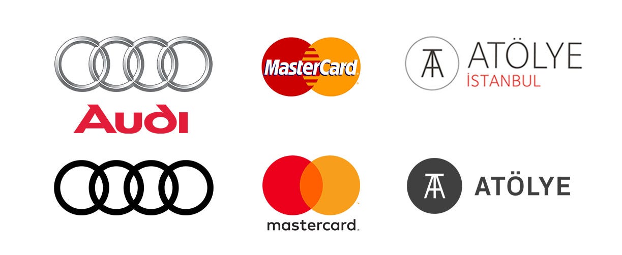
Looking back, we see that we intuitively followed a design journey that was aligned with the branding story of Audi and MasterCard, where a basic circular form is distilled to its key elements, with a standalone logomark and a bold, legible typeface.
The Future
Our business model and strategic decisions may change over time, but we believe that our brand should stand as a representation of our core vision, which is to become a defining image of design-driven, community-centered, and impact-oriented transdisciplinary innovation, both local and abroad. Over the last few years, we have refined our logo to meet these expectations, and hope that its current version enables the signifier effect that we are after.
What do you think? Please, give us your feedback in the comments section.
Please sign up below to receive ATÖLYE's monthly email newsletter: http://eepurl.com/cLJwK5