Explorations in Interface Design: The New ATÖLYE Website
Published in ATÖLYE Insights · 7 min read · June 21, 2017
Authors: engin ayaz, Co-founder and Head of Design, Emre Erbirer, Communications Lead
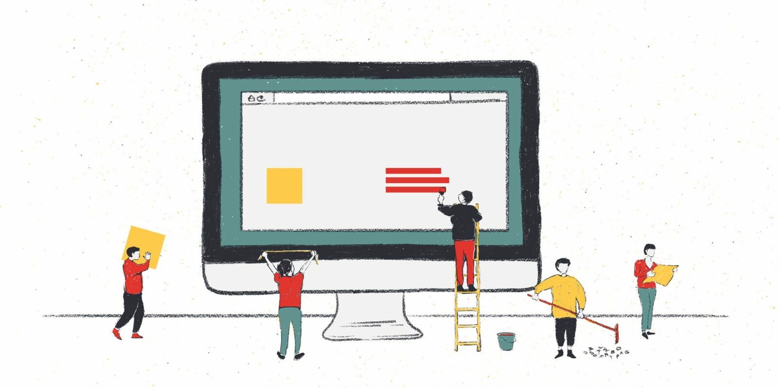
We consider each project where we are our own client as a great opportunity for experimentation. Therefore, when we embarked on the journey to redesign our website in October 2016, we set ourselves to not only create a better synthesis of content, but also to develop few strategic design moves that would both surprise and delight users of the website. Following the mantra of John Maeda, we persistently asked ourselves:
"Are we subtracting the obvious, and adding the meaningful?"
Working in tandem with the very talented full-stack designer and developer Can Usta, we engaged a subset of ATÖLYE's diverse core team including a design researcher, a UX designer, a strategist, a communications expert and another multidisciplinary designer. Over the course of four months, we went through an extensive brief refinement process, a dozen UI design systems, along with iterations on coded prototypes. To get appropriate user feedback, we hosted three separate feedback sessions with our community along with select stakeholders.
What resulted is a content-forward and action-driven minimalist website that allows us to evolve our digital identity along with our organization.
In terms of key innovations, we explored the following questions:
- How might we leave sufficient breathing room in a landing page while providing timely updates as well as a general aura for our vision?
- How might we create a fluid, unobstructed slideshow in each page while giving just-enough context?
- How might we develop an easily discoverable call-to-action system across the whole site?
- How might we use forms and colors to create a consistent and unique branding both online and offline?
Our solutions are as follows.
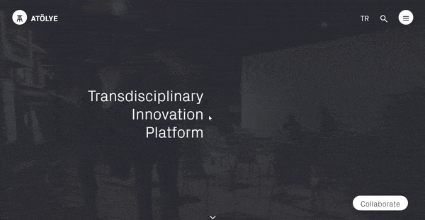
Hero Header = Menu
Usually in websites, the menu and the hero header are completely separate, both visually and cognitively (for more on hero headers, see this article by UXPin). Whereas the menu becomes a cluttered mess split between the header and the footer of the page, the hero header remains too abstract and generic without the necessary content backup.
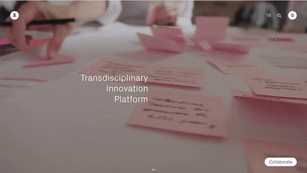
Subtracting the obvious, we combined the two elements, where the menu becomes an articulation of the specific words within the hero header. When the hamburger button is clicked, the visitor discovers the menu sub-items appearing along each word of the hero header.
- Transdisciplinary: Articulates the structure behind the system, driven by a wide spectrum of disciplines, skillsets and characters, organized in a unique way. Community comes second, and the team after, both in the website and in the space.
- Innovation: Shows our approach to project development, where case studies led by our core team are coupled with collaborations led by the wider community.
- Platform: The container and the enabler of everything. Consists of a workspace, a makerlab and an events venue, with a full calendar of gatherings.
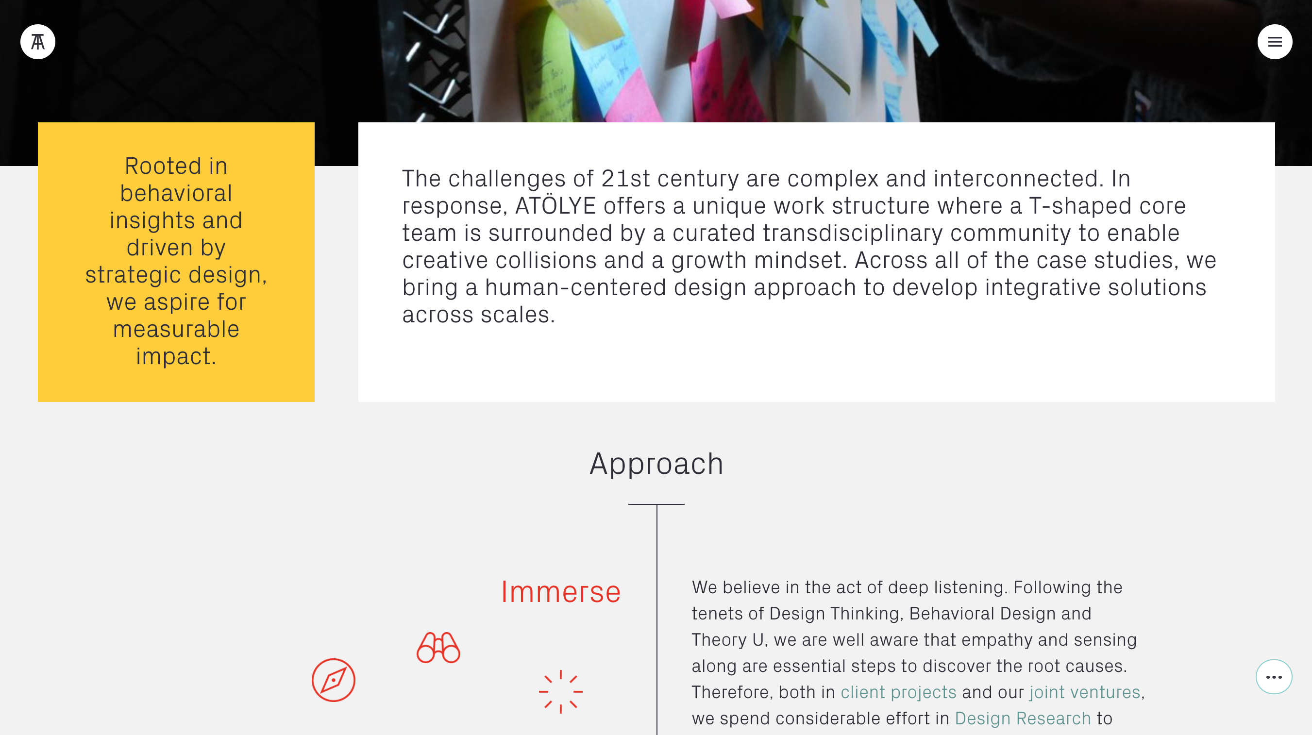
Ephemeral Headlines & Logo
Usually, headline texts and logos on websites either take a lot of pixel real estate, or they are in visual conflict with images behind them. To circumvent this challenge, we developed a behavioral model where the logo and headline text remains just long enough to set the context and then disappears.
This eventual clearance of the title also allows to turn the top area into a natural slideshow, which is both animated as well as can be controlled by clicking on the left and right side of the page.
The system also applies for the ATÖLYE logo, which is usually used with its symbol only, and the written part of the logo only appears during page loadings. When scrolled down, the logo's written part disappears while the logo's location is shifted slightly to the left to make room for content. This helps minimize clutter while reinforcing the visual memory for the logo across the whole site.
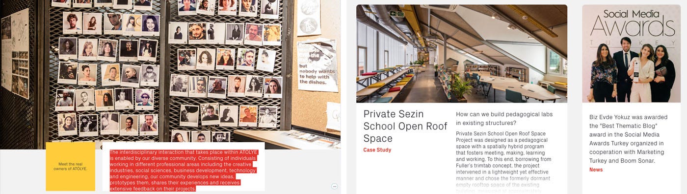
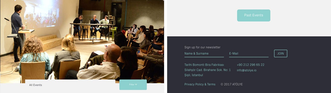
Contextual and Personable Call to Action
Call to action is a crucial component of all websites, yet it is usually located as a button in a static manner. Even when it floats across the scrolling action, the content of call to action remains the same in different pages (e.g. chat buttons).
We decided to place a dedicated "call to action" button is located on the lower right side of the screen. The content and link of this button changes, yet the behavior remains the same. It is visible on all pages when loaded and remains as a circle with three dots and a thin green outline when being scrolled down. At the end of the page, the content for the call-to-action reappears again, aligning itself well with the layout of the footer.
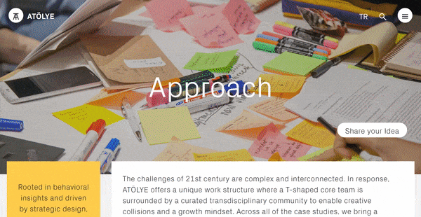
A meta-level call to action system for the homepage is also devised, providing a summary for all possible actions for the user. Each action is connected to a specific person in the team, thus providing a more personal touch, followed by a tailor-made form that is linked to a CMS system in the background.
Consistent Type, Form and Color
We find that in most current websites, is not easy to find a rigorous mapping of forms and colors to behavior and content. Links are usually shown as underlined or colored text, and colors rarely map directly to certain content types. Type is also fragmented across the site, and does not usually map directly to type used in print.
We applied a simplicity-based design logic that spans type, form and color, all of which enabled us to create a holistic brand system both online and offline.
Type: Using Optimo's edgy yet playful PX Grotesk as our anchor font, we simplified the visual system by remaining consistent in our logo, hero text, headlines and body text.
This visual uniformity and flatness enables a simple way of achieving consistency in a community-driven platform where a lot of events, workshops and projects happen in synchrony. The type recedes in the background while adding a certain character and allowing the content and visuals to flourish.
Form: A four-column grid system is used across the whole site. This forms a reliable backbone for the content to be organized in a modular fashion. Cascading levels of detail are possible, where boxes can function as links or post-it highlight notes, and where images can be juxtaposed in square forms (allowing reposting in Instagram), as well as landscape and vertical formats.

Aside from proportions, a secondary differentiation comes with edge treatment. Whereas static content is always placed in sharp-edged containers, all links have rounded corners to further differentiate the content. A subtle fuzzy shadow animation is applied to the links for hover-over state as well.
Color: ATÖLYE's three primary colors are red, light green and saffron yellow. Each of these colors have different cognitive affordances and are thus used across the site in measured ways.
Red is applied for cursor highlights, as it allows the content to pop while creating a small surprise for the everyday user who is used to seeing the pale light-blue browser standard. Secondarily, red is used in measured form for tags, such as Venture vs Client Project, or Event vs. Case Study.
Light green is used as the main accent color across the website, allowing for all the links to pop without becoming too dominant. The same color is also used extensively in ATÖLYE's physical space, thus reinforcing design consistency.
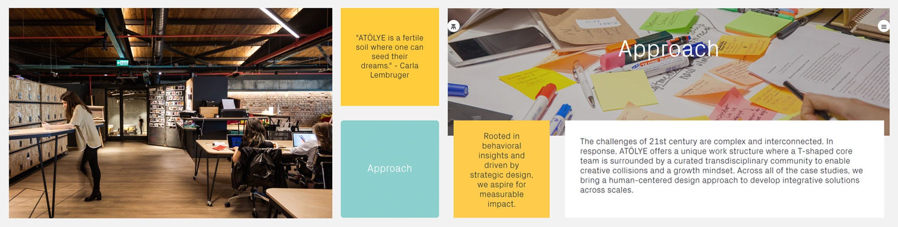
Saffron yellow is used as the static text highlight color, which enables a post-it like effect for highlighting. It also creates a certain warmth, balancing the light green in color composition.
Social Media & Print: Using consistent design principles, we also refined our social media posts and print posters. The same type, along with basic shapes, bold imagery and measured color, enables a system that becomes an extension of the website, and vice versa.
Conclusion
By establishing a rigorous pattern language for our website, we created an extension of our brand that achieved a crisp look-and-feel along with novel behavioral moments. In the current pace of interface trends, it is hard to gauge until when this website will remain relevant. However, we believe that our solution, with its minimal yet effective elements, may resonate in years to come.
Please share your comments below.
Please sign up below to receive ATÖLYE's weekly e-newsletter: http://eepurl.com/cLJwK5